The 1970s "New Look"
The thumbnail images on this page may either be viewed individually or in slide show format.

Each image has a date and brief description at the bottom.

To view individual images click on the image and then click on the close icon at the bottom when finished.

everythingPanAm.com
The Virtual Pan Am Museum
You may begin the slide show at any picture by clicking on an image.  You must advance  the  images yourself.  To move the slide show forward you may press the "N" key (for next) or mouse over the upper right portion of the image  and click on the "next" pop up tab.  To move backward you may press the "P" key (for previous) or mouse over the upper left portion of the image and click on the "prev" pop up.  You may close the slide show from any image by moving the mouse to the lower right portion of the image and selecting close.   Enlarged slide show images are different sizes and in some instances you may need to scroll around to see all of the image.
Sample brochure covers promoting New York early 1970s
Sample brochure covers promoting New York in Spanish from the early 1970s
Sample brochure covers promoting New York in Japanese  from the early 1970s
A sample marketing display promoting Pan Am destinations from the early 1970s
A 1971 tour brochure cover featuring the Helvetica style font.
A 1972 tour brochure cover for Hawaii featuring the Helvetica style font.
Early 1970s New York City Helvetica style letterhead.  This type of document was called a shell and could be used for multiple promotions of fares and events for New York.
A 1971 Hidden Europe brochure cover with the Helvetica style logo.
A 1971 Helvetica style Book of Events
A 1971 Worldwide Shopping Guide in the Helvetica style
An early 1970s El Borincano Service baggage sticker in the Helvetica style.  The El Borincano service was a marketing campaign Pan Am introduced in the early 1970s for service to Puerto Rico to compete with American Airlines that had recently begun to compete with Pan Am on the New York - San Juan route.
A 1970s Employee parking permit in the Helvetica style.
Printed Material
Ads & Posters
A 1971 Ad for Pan Am's Business Jet Division targeted at large corporations.
An early 1970s ad featuring Pan Am stewardess Ilona Zohn
A 1971 Pan Am World Traveler ad promoting the Pacific Islands.
A 1972 ad promoting Pan Am's experience and world wide network.
A1972 Pan Am ad promoting family reunions .
A 1972 ad promoting the depth of Pan Am's experience & world wide network.
A 1970s marketing customer letter in the Helvetica style promoting new service to the Caribbean.
An article explaining how some of Pan Am's early 1970s posters were selected to join the collection of the New York Museum of Modern Art.
Pos 1960s Peter Max 747
An early 1970s Poster in the Helvetica style promoting Disney World.
An early 1970s Poster in the Helvetica style promoting France.
An early 1970s Poster in the Helvetical style promoting New Zealand.
A 1970s Pan Am mug in the Helvetica style.
Early 1970s Pan Am matches in the Helvetica style.
An early 1970s Pan Am ashtray in the Helvetica style promoting a mini hub from Boston to Europe.
A 1970s Pan Am money clip in the Helvetica style
A promotional glass in the Helvetica style from the February 1972 visit of President Nixon to the People's Republic of China.
Early 1970s Pan Am flight bags with the Helvetica stle logo.
In the early 1970s Pan Am introduced cocktail sticks with the Helvetica logo.  Though the Arial logo was retired from most printed material by late 1974 the Arial cocktail sticks remained in use until the late 1980s.
An early 1970s Pan Am kiddie wing in the Helvetica style.  It is not known if this style of kiddie wings was actually distributed to children or if this was just a production sample.
For young unaccompanied minors Pan Am had a pouch for them to wear so they could be easily identified by flight and ground crew.  This sameple in the Helvetica style dates from the early 1970s.
An air sick / in-flight waste bag from the early 1970s in the Helvetica style.
Pan Am in-flight chop sticks from the early 1970s in the Helvetica style.
Pan Am playing cards from the early 1970s in the Helvetical style.
In-flight & Cutomer "give-a-ways"
Timetables
Rio de Janeiro was featured on the Aug-Sep-Oct 1971 Pan Am timetable in the Helvetica style
A Portuguese fishing scene was featured on the Feb1 - Apr 29 1972 Pan Am timetable in the Helvetica style.
A Norwegian fjord was featured on the Apr30 - Jul 31 1972 Pan Am timetable in the Helvetica style.
A water scene from New York State was featured on the Jul 01 - Oct 28, 1972 Pan Am timetable in the Helvetica style.
A Hawaiian beech scene was featured on the Oct 29 , 1972- Jan 31, 1973 Pan Am timetable in the Helvetica style.
An Irish country scene was featured on the cover of the Feb, Mar, Apr 1973 Pan Am timetable in the Helvetica style.
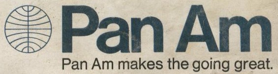
As the 1960s drew to a close marketing focus groups revealed that the public perceived Pan Am as a bit stodgy and lacking in hipness.  In order to try and appeal to a younger traveling demographic Pan Am hired the design firm, Chermayeff & Geismar, to ‘modernize’ the Pan Am image.  This company initiated several changes including a campaign to appeal to young and single travelers as well as introducing a new ‘print’ image.  The new print campaign included a change from the traditional  ‘wind swept’ ‘Pan Am’ lettering to the more modern Helvetica font.  To see informtaion on this logo on two other web sites click here or here.
Pan Am also repainted both a Boeing 707 & 727 with the Helvetica style lettering on the side of the fuselage as a “market test.”  In the Spring of 1973 the Helvetica style logo was abandoned with a return to a slightly modified ‘wind swept’ logo that the company would use until It ceased operations in December of 1991.  The last Pan Am logo was purchased from the estate of the original airline and was used by both subsequent owners.  Below are examples of the ‘pre’ and ‘post’ Helvetica logos.
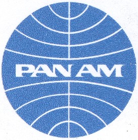
The pre-Helvetica logo was used by Pan Am from 1957 through 1970.  On this logo the "Pan Am" letters do not touch and have 'triangular' points (see the base of the 'P').
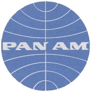
The post-Helvetica logo was used by Pan Am from 1973 through 1991.  On this logo the "Pan Am" letters touch and have more rounded edges and sharper points (see the base of the 'P').
Below, are some other examples of Pan Am 1970s "mod" look, including, a youth-oriented brochure on New York City in several languages, a 747 poster designed by famed artist Peter Max,  award-winning displays for ticket offices and travel agents, and multiple items with the Helvetica logo, brochures, letterheads, ads, posters, and timetables.